Next Project – City Tiles
 This week was pretty lazy for me as I get back into the grind of work. I wasn’t up for another 100+ hour research project, so I decided I want to do something else for my next project.
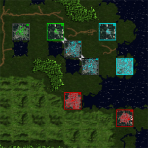
I found a beautiful rural intersection while browsing through my 2008 GPS map which led me to re-open my old project on city graphics files from last year. The screenshot shows a quick sample of my progress so far this week. It’s a scaled down shot of the Yangtze River Delta taken from the world map generator. It shows multiple efficiency levels and three color variations. Several cities are also occupied and are meant to stand out a bit more.
One thing you may notice is the pixelation of the terrain tiles next to these city tiles. This is thanks to one of the forum posters who pointed out that EDCE supports 128×128 tiles if you modify the default set to support it. This was both a huge let down and also an exciting discovery. The let down is I will have to re-do the entire Blue Marble set before I am satisfied with it. The exciting part is that I get to re-do the Blue Marble set in HD once I find the time. I’m not holding my breath on this though, as the current 32×32 took quite enough time to get in a usable state. I don’t think I’m ready to go through that again.
Anyway, all of this has led me to find a couple of quirks I’ll need to think through. The main one is how the unity engine seems to be handling zoom. The cities look pretty when up close up. But in a competitive game its sometimes hard to see because of how it scales. For example, it’s difficult to see who owns which city at max zoom and it’s easy to miss something. I’m debating how I want to fix that. The only options I have right now will require me to sacrifice some of the artistic features I was implementing, which I don’t want to do.
There is a good chance I may just say screw the UI/playability aspect and just release it. After all, half the fun of any game is being able to look at it, right?


