Empire Deluxe Unit Template (EDUT) – Version 1.2
I have updated the original EDUT template to a new version. Going forward, all newly released units using this template will have version 1.2 applies. Since the template changes are backward compatible, all previously released unit sets will remain unchanged.
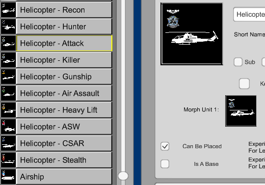
The update adds a new Height (Altimeter/Depth) section. This primarily impacts aircraft and submarines, but applies to any unit where height provides unique combat abilities. This section includes a height marker (an altimeter for aircraft, a depth gauge for submarines) and a cockpit view for better visual feedback at farther zoom levels. This will replace the high/low markers being used on some custom requests.
Reading the Empire Deluxe Unit Template (EDUT) Layout

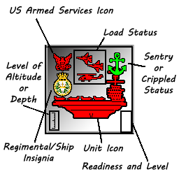
For reference, here is a consolidated list of identifiers for the EDUT template as of this post. The picture attached to this post provides a visual reference to locate each section. Starting with Unit Icon (bottom center) and going clockwise:
- Main Unit Icon – This is the main unit image. Each one has an active and sentry (pictured is sentry) version. If applicable, a loaded/unloaded version, grounded/airborne version of this unit (up to 8 versions) may apply. Grounded versions may appear lower on the tile instead of centered.
- Insignia or Zoom Identifier – Regimental/Ship identifier is a unique icon for this unit. At far distances, the Main Unit Icon can look the same, especially for ships. This provides an identifier using colorized insignia’s to identify similarly shaped units at higher zoom levels.
- Height/Altitude/Depth – Provides an altimeter/depth gauge and a cockpit/periscope view. This measures at what height the unit is fighting. For units that can land, the height indicator does not appear. Units that do not have this feature such as ground units do not have this indicator.
- Owner Icon – Provides a colored version of the Armed Services Branch for this unit. This allows easy ownership identification at higher zoom levels. In most cases this is done by coloring the Main Unit Icon. This provides a secondary identifier for consistency.
- Load Status – Provides the loaded and unloaded conditions. The icons in this area show the primary cargo type carried by this type of unit. For units that can hold loaded cargo, a box/crate may be shown instead of it’s primary cargo type.
- Activity State – Game offers three states – Active, Sentry, and Dug-in. The are represented in multiple locations (see footnote)*
- Health Status – Game offers two states – Active and Crippled. The are represented in multiple locations (see footnote)*
- Readiness State – Game offers five levels of readiness. The are represented in multiple locations (see footnote)*
- Unit Level – Game offers three levels of experience. The are represented in multiple locations (see footnote)*
* These four sections are represented in the right-hand side of the tile as well as overlays/backgrounds. These sections operate symbiotically and are combined with other identifiers to provide better input to the user. Status icons (shown on top right and bottom right), visual overlay (not pictured), and background colors (sentry background pictured) are used dynamically together for an enhanced experience, but will not over-write other labeled sections of the template.


One Comment