Status Icons For Units Uploaded
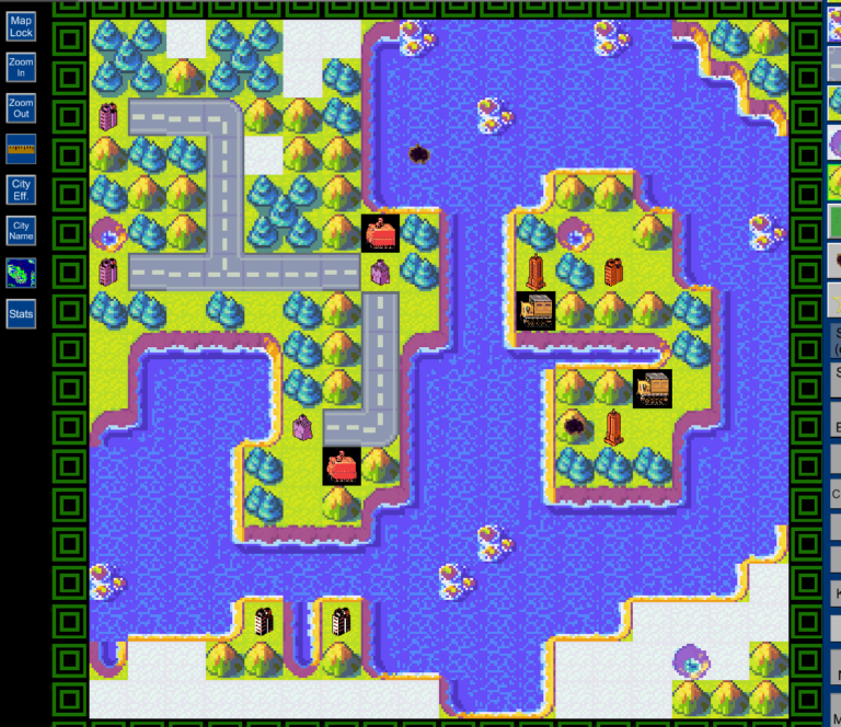
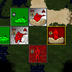 I’ve uploaded the status icons I am using for my new unit tiles on EDIBLE. I wanted tiles that used the higher definition 128×128 capabilities that were easy to spot from a higher zoom level. This replace two icons which I didn’t think were very intuitive – the brown triangles for “Dug In” and the red line for crippled. The third is a new “activated unit” border that follows the default but is thinner and outlined to match the new unit sets I’ve made.
This is the first of two “cosmetic uploads” that support the unit tiles. The other will be the over flight icons. Since I plan to use the same unit template for my upcoming projects, this upload is meant to work universally and not apply to just the uploads I’ve made to-date.
Download File
