Emperor of the Fading Suns – Five Houses
Over the past two months, I’ve started investing time into a legacy game called Emperor of the Fading Suns. This is a game from the 90’s and is in a similar vein as Empire Deluxe in terms of its roots in the golden era of computer gaming. The game has been getting some steady updates from the developers and I’ve started taking an interest in making mods for this game as I did for Empire Deluxe. I don’t know what the future will hold just yet, but the game seems to allow some decent moddability, but I’m still uncertain how supportable it is.
Below is my first minor mod for the game. It is purely graphic in nature. For those who followed me in the early days of Empire Deluxe modding, you remember I also started with graphic modding before I slowly expanded into full replacement modding, so let’s see if history repeats itself.
In the meantime, please enjoy these small graphic redesigns of the five major houses in the game. I’ve also included my design notes for what I was doing, and how I felt about the final result.
Li Halan (In Game Color Purple)

The default Li-Halan graphic was a cross with a circle on the four quadrants. I actually like the overall design, with the concept being a merge of various religious origins. I cleaned up the symmetry and left most of it unchanged. I also gave it the same volumetric treatment as other houses so it has a more 3D feel.
My understanding of the lore is this faction is friends with the church, so a cross being the main part of their icon makes sense. I also believe the faction has oriental origins, so I attempted to re-draw the image into a calligraphy inspired symbol based on the Asian word meaning “Vessel that speaks for the land” but the palette limitations made this difficult. If I can find some creative way to make the shading work, I will be revisiting this theme.
Hazat (In Game Color Red)

The symbol for the Hazat is a clawed gauntlet. I cleaned up some of the odd angles on the icon and re-shaped the curves to be more symmetrical. For instance, the circumference of the thumb and index finger now align with the center of origin at the palm. I thought it was more fitting to break up the white background since it caused visual oddities, especially when scaled. I couldn’t find any inspiration for this icon choice, so I chose to work with the existing theme instead of changing it to something that is more fitting of Mediterranean culture.
Originally I planned to have the claw reaching down for a city on the map, and the two points of the Chevron coming together in a ripple effect as if they were tearing a path through the map. Alas, the palette made this difficult to achieve, but I’m passionate about trying to get this concept to come to life so there might be an update in the future.
Decados (In Game Color Green)

The Mantis is the icon for Decados. The main change I made for this is to apply the same shading that I did for the previous ones to help provide some color and volume. I also switched to a side stripe of green to compliment the mantis icon which visually flows in the opposite direction. The end result is a crisscross X pattern which seemed a bit more visually appealing to me. I also changed the trim to gold.
My long-term goal for this is to make a full-size mantis icon. However, I ran in to trouble with scaling, essentially the limited pixel size meant I couldn’t get the whole thing on the image while keeping the highlights around key things like the eyes. It effectively looked like a stick figure. I will be revisiting this once I get some downtime to actually try some techniques and pixel silhouetting and try to make that full mantis graphic work.
Hawkwood (In Game Color Blue)
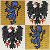
Hawkwood, per my understanding of the lore, is an amalgamation of the many former royal houses of Europe. The default icon is a lion in game. I thought it would be more fitting if I included the various noble symbols that were used in Europe. Per my own research, the most used were the Lion, Eagle, Fleur di lis (diamonds), and to some extent various birds like hawks/doves. I decided to take a coat of arms approach, and since “hawk” is in the faction name, I included an eagle and a lion on a checkerboard. I changed the blue background to gold to represent the gold Fleur di lis in spirit. The pencil line shading on the original graphic has been accentuated as the background to make it slightly different than the others.
This was my favorite one to make because of the real-life history this idea represents. I wish I had more real-estate to put more fancy emblems on this. I have no regrets though, other than the lack of red color. I didn’t want to change it for this first pass, as the house color is blue in game and I felt it was already going to be confusing in its present form, even with the blue lion still in the image.
Al Malik (In Game Color Yellow)
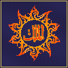
The original design had several star/sun symbols and I didn’t understand what they represented. From game lore, my understanding is they are one of the newer factions so I felt it was fitting if I didn’t use some of the same design features as the other houses. The symbol is a stylized sun being impacted by an eclipse. In the middle of the eclipse is the arabic word “al-malik” or as close as one can probably get if they don’t speak/write the language.
This is the faction icon I changed the most since I had to tweak all the end points numerous times to avoid blunt ends (this is an issue with even pixel sizing which is hard coded in the game’s UI). The theme of the game, Fading Suns, is supposed to represent a phenomenon where the suns are dimming. The idea of a faction representing hope inside of a sun that is fading behind an eclipse invoked the type of image that I think the developers are trying to portray in the game. This is a faction trying to become the ruler of hope for the people in this galaxy.