Enhanced Terrain Set Uploaded
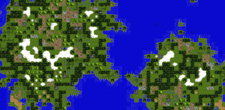
 The new Enhanced Terrain Set (ETS) has been uploaded to EDIBLE. This set attempts to enhance the definition of the default terrain set by improving the depth of the art at closer zoom levels while retaining the same look and feel as the original terrain set when viewed at a distance. It uses a mix of isometric and top down images like the original set and uses a color and contrast that is slightly darker than the original set.
I came up with the idea to do an enhanced terrain set based on some EDCE reviews saying the graphics were “dated.” I opted to stick to the same mix of isometric and top-down tiles as the original set as I wanted a like for like upgrade of the default terrain. I personally prefer that all tiles use one method or the other, but I was concerned that switching the style might turn off players who are used to the original set. I remember experiencing this same issue when I switched between the default terrain and BMT and found that I liked one set over the other on certain maps.
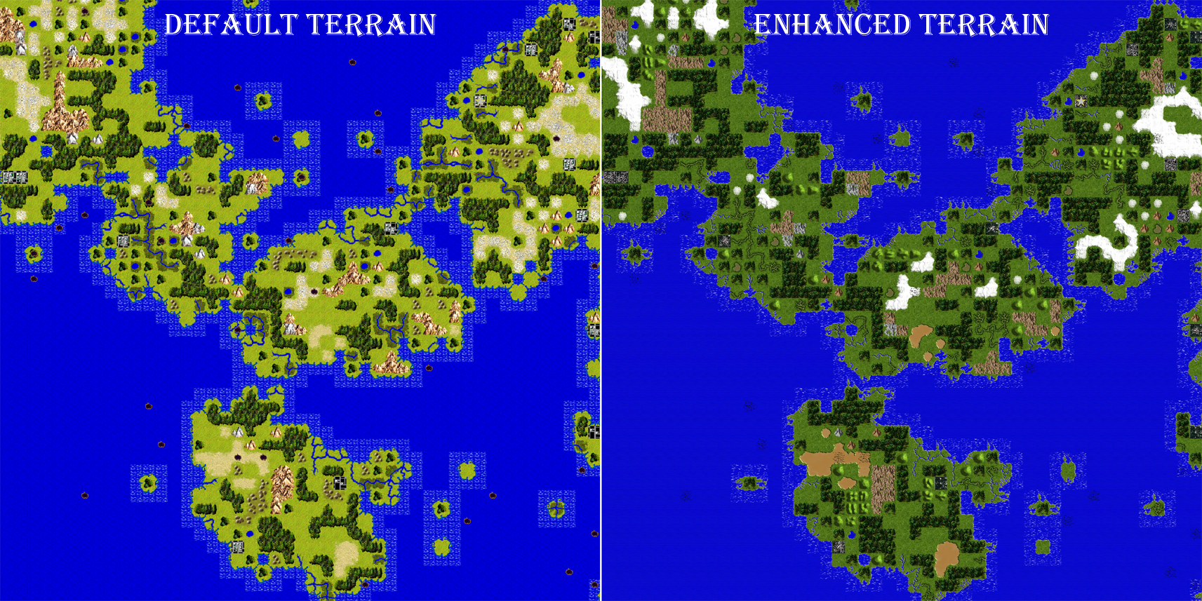
This set uses a slightly darker contrast than the original set. This is due to the brighter greens in the grass blades causing some noticeable tearing when zoomed all the way out. This also occurred with the shallows as well. I did some basic investigation into this anomaly (a deeper analysis from a year ago can be found here) and the problem is due to how Unity scales the png sprite maps when you zoom in and out. The fix for this would require some significant development effort, so I opted to just remove the brighter anomalies as a quicker fix.
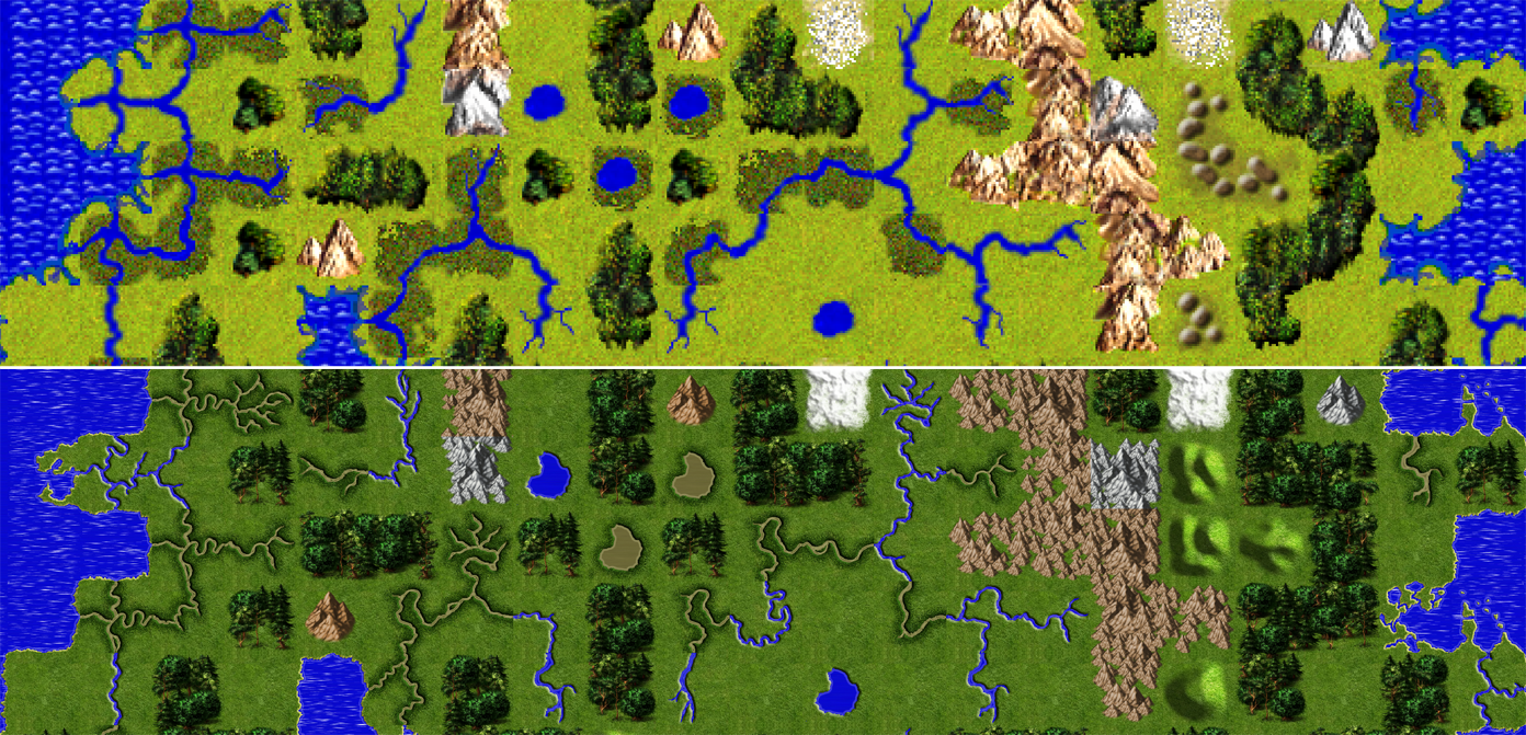
Another change from the default is the rivers. I opted for a slimmer river style than the original set as the river deltas came out better this way. I also opted for brackish water for marsh tiles instead of blue, as I think the contrast worked well in BMT. I am not disappointed with the results, but if it becomes possible to make true river deltas in EDCE, I will widen the rivers and add rapids and rocks back into the tiles.
One of the complaints from the original terrain is that snow and desert look the same. As you can see in the tile list shown on below, they are almost identical except for some slight contrast differences. In this set, I hand painted these using two separate artistic styles and coloration to help keep them separate. Snow terrain has a layer of permafrost hidden underneath lumpy white terrain. Desert is significantly darker and appears as wind swept sandy valleys with rocks strewn around when you zoom in. Hopefully, this will help differentiate them during play.
Lastly, I will comment on mountains and hills. The original set uses top-down view of hills and isometric for trees and mountains. This set uses the same layout. I am not happy with the mountains in their current form so I will be making changes in the future. I am particularly unhappy how they appear “square” when zoomed out. I plan to thin these out and do the same for trees if the set becomes popular enough. As for hills, it takes some time to adjust to their top-down view, especially when they appear near forests and mountains which are noticeably isometric. This is less of a problem in the original set because the bumps are smaller, but in this set I had to remove the brown dirt, so it was easier on the eyes and was not mixed up with desert.
Download